There has long been a “discussion”, to use as neutral phrase as possible, between those that prefer photographs to be “straight out of the camera” and those that are happy for the final image to have been edited in some way. Interestingly, although we typically associate image editing with the digital arena, the concept of retouching photos is equally applicable to the medium of film. I would recommend taking a look at this fascinating article from 2012 about Magnum Photos and the work that goes into getting the final image from the original negative.
For me, the ultimate aim of the whole creative process is for the audience to like what they see. For me, it really is that simple. As a result, I am happy to use editing tools, mainly Adobe Photoshop, to realise my creative vision for the image. Since I am not in the habit of entering natural history photographic competitions, I don’t see the work that happens after the camera shutter has closed as “cheating”, or any other such negative word. It is merely a step in a larger process.
Over the years, I have removed countless pieces of litter, inconsiderately located tree branches and blades of grass from my images. I have moved sheep up hills, though only in a digital manner, to improve the composition of photos. I have turned many a lush green landscape into monochrome to emphasise the textures and boosted the colours in yet more.
As long as I am not misrepresenting my work as being “untouched”, I don’t see any harm in it.
When it comes to the more traditional creative pursuits of drawing and painting, a similar thought process applies. I have never been able to draw or paint particularly well. In fact, it is the challenge of not being able to express myself in these ways that led me to photography in the first place. The lens becomes my brush, the sensor my canvas.
Visual effect creation
Recently, I have been spending a lot of time using an iPad to create digital imagery and have really enjoyed doing so. One of my new favourite apps is Procreate. I have been experimenting with the brushes that come bundled with the app, as well as those available online and have been pleasantly surprised by the results. One of the features that Procreate offers is the ability to alter a brush stroke after is has been made. I would imagine that it was envisaged for making minor corrections, but I have been making far larger changes to the paths. Given the path updates in real time, I found that you can create some interesting visual effects through simply recording the screen when manipulating these paths, especially when using more abstract brushes.
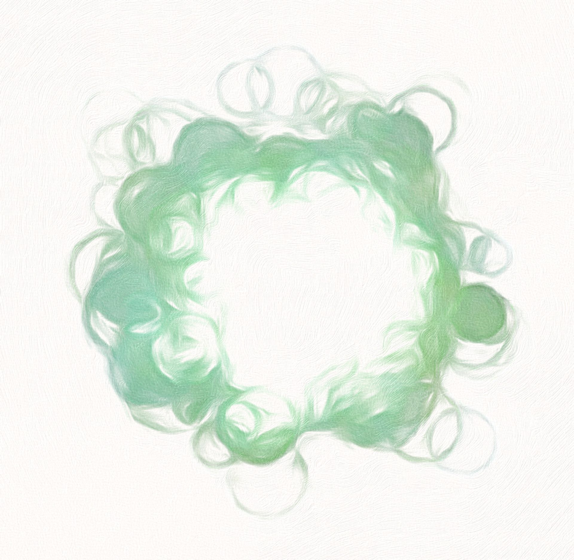
Some of these were almost microbial in nature, such as this one:
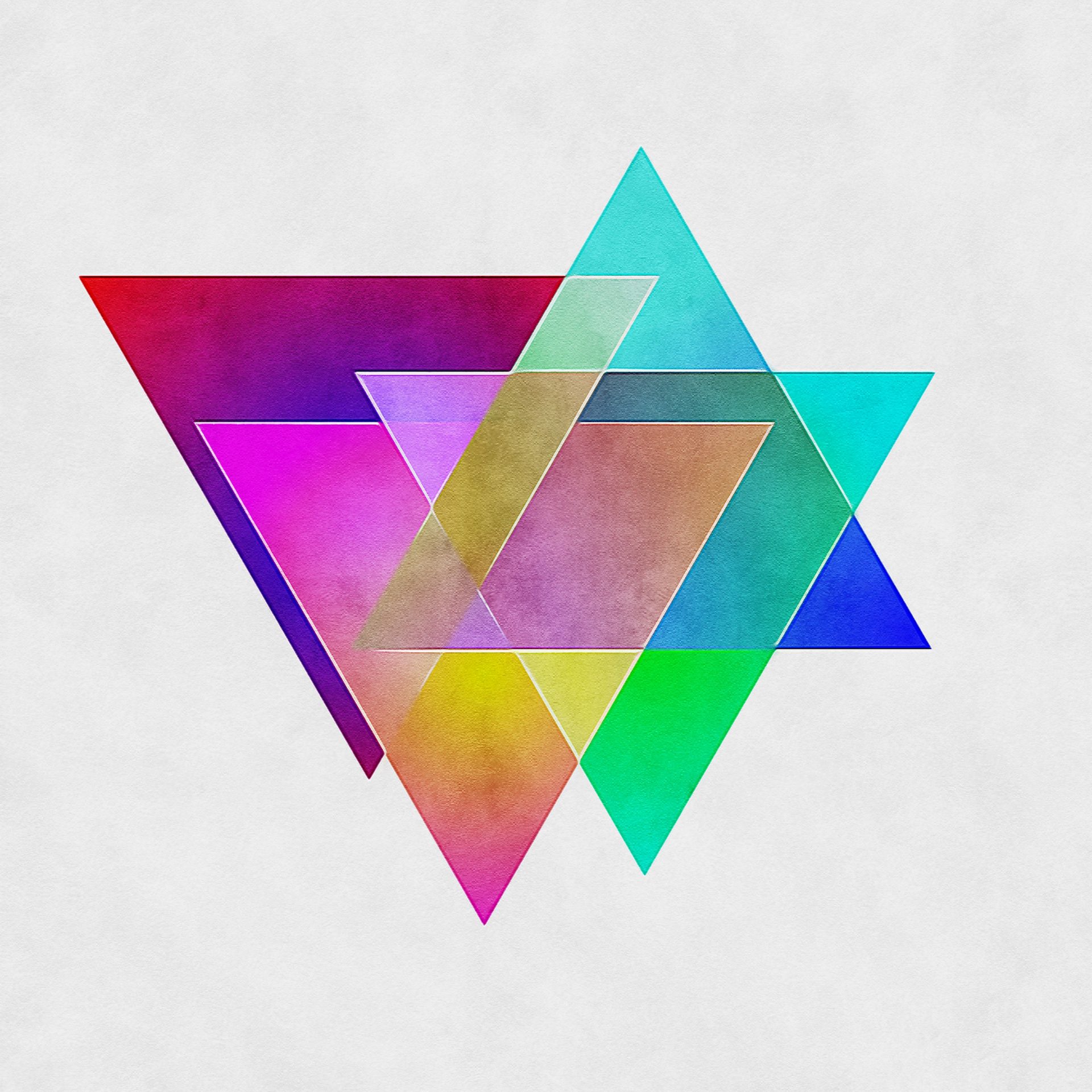
I created others that were more colourful. When working on this image, I was thinking that the yellow area could represent sound, and would change in size corresponding to the volume.
“Painting”
There are several apps and plugins available that take an image, typically a photograph, and process it to give the appearance of it having been painted. I have been using one of these as a plugin for Photoshop for a number of years. It has been especially successful when printed at large scale on canvas, as the actual texture of the canvas complements the “painterly” effect nicely.
I began to wonder how effective this technique would be when applied to more graphic designs.
Here is a slider comparison, with the original graphic on the left and the “painted” image on the right.


with more results here:


I have yet to print any of these graphics on canvas but I believe that they would work well.
Video paintings
I took things a step further when I applied this “painting” technique to the graphical animations. The particular app that I was using, Brushstroke, was able to apply all sorts of painting styles to the images and videos. I decided to take one of the more striking animations and put it through one of the more abstract filters and was very intrigued by the results.
Concluding thoughts
I am certainly not claiming that any of these tools produce results that could compare with those created by a professional in their field, be it an animator or fine artist. However, for very little effort, they can produce interesting results that could easily be used to provide a proof of concept for a design idea. And experimenting with them certainly entertained me for a few hours.
More than ever, though, I am increasingly certain in my belief that individual creatives should not be “chastised” by the wider creator community for using tools such as the ones discussed above. Providing there is no intention to misrepresent the work for personal gain, we should all be able to use those tools available to us to help realise our creative vision. After all, surely all art and design ultimately boils down to the simple question – “Do you like what you see?”.